
Here are some recommendations for making scientific graphics which help your audience understand your data as easily as possible. Your graphics should be striking, readily understandable, should avoid distorting the data (unless you really mean to), and be safe for those who are colourblind. Remember, there are no really “right” or “wrong” palettes (OK, maybe […]

TL;DR Viridis is a better palette than Rainbow for identifying a subtle feature in data. How does a plot’s colour palette affect our ability to find a subtle feature in data? Friend and colleague of Better Figures Tim Graham came up with a fun way to find out. Tim sent some Python code to plot a nice […]

How are we doing in getting rid of the dreaded rainbow colour scheme in scientific visualisations? On a whim, I asked for people to count presentations or posters with Rainbow palettes at this year’s meeting of European Earth sciences mega-meeting, the EGU general assembly. Many thanks to those that stepped up. This was clearly a […]
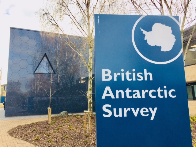
Better figures got a lovely reception at the British Antarctic Survey (BAS) in Cambridge today. A tour of the building (ask to see the albatross), a cool mapping lab, and an engaged audience. Polar scientists have an interesting set of visualisation problems – including the fact that one of their primary interests (sea ice extent, […]
After seeing John Kennedy’s new visualisation of warming by latitude, Richard Erskine (@essaysconcern) suggested that there should be awards for climate visualisation. We heartily agree here at Better Figures, there is so much excellent work going on that should be highlighted, celebrated and shared. We could certainly do an annual round up of the best […]

I caught up with Met Office data visualiser extraordinaire (and old chum), Neil Kaye, to talk about the process of making his new plot on visualising global temperatures, and why he made certain decisions. Here is the plot: Doug: What gave you the idea for the plot, what was the inspiration? Neil: Originally the idea was […]
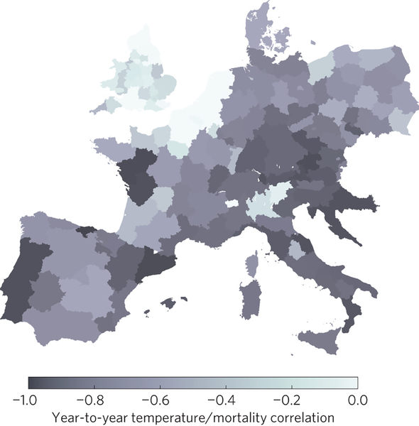
A really nice example of the use of colour in a map here. The image is from a new paper on the relationships between cold weather, influenza and mortality in Nature Climate Change (ht Ed Hawkins). The authors have chosen a simple monochrome palette, and the map is clear from any distracting clutter. I guess […]

What an achievement! Yesterday, the lovely perceptually accurate open source colour palette, Viridis (we discussed it here) turned up in a major paper. The paper itself was on some gravity discovery or something, but we need to focus on what’s important here. Well done everyone.
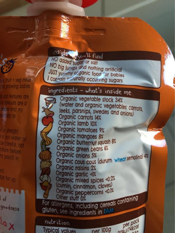
It turns out that my infant son has a milk allergy (not intolerance). He’ll probably grow out of it, but in the meantime we have to be careful not to feed him anything that might contain cow’s milk. This is much easier since 2014, as the UK’s food labelling laws changed so that allergens must […]
That’s Royal Meterological Society at the European Centre for Medium Range Weather Forecasting. We had an afternoon of Visualisation of Meterological data, part of the ECMWF visualisation week, and Better Figures was lucky enough to be invited to present (download the slides). ECMWF was great, in that they have preserved the 1970’s decor beautifully, alongside […]
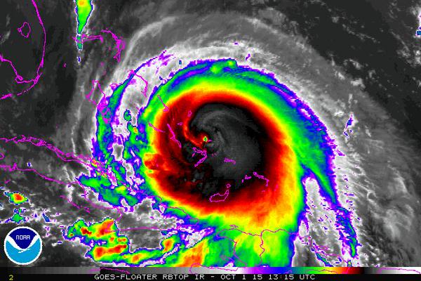
At the time of writing, the US media is tracking Hurricane Joaquin, and trying to predict whether it will make landfall in the US over the next few days. There are lots of great visualisations, but one thing that this event does highlight is just how many different types of rainbow colour palette there are. […]

