Monthly Archives: September 2012
Better Palettes
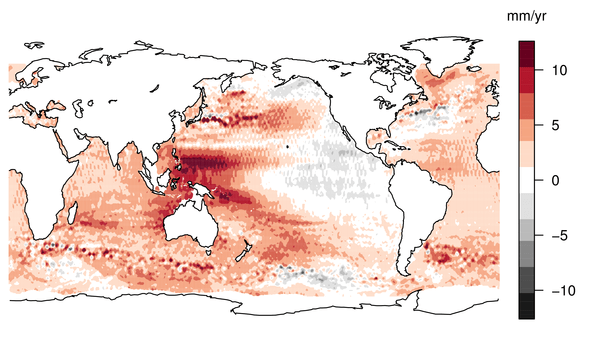
Earlier this week, we were treated to some lovely unadulterated* sciency data, in the shape of a map of sea level rise in the last 18 years. The story got good coverage in the mainstream media, and an old friend of mine even got quoted on the BBC. Great. The reaction on twitter however, often […]

Drought small multiple
A playful look at a serious subject from Mike Bostock. He uses a small multiple, animated over each year, to show the impact and context of this year’s drought in the US. Click the image to see the animation (it might take a little while to load). The colour scheme and layout are great here. Being […]

Decadal Temperatures
My colleague John Kennedy has asked for some feedback on this figure, showing the evolution of global average temperatures, since the 1850s. The data is from HadCRUT3, and is averaged into decades. I like this figure a lot. I think it is clear and crisp; the colours have appropriate cultural meanings; the rise in global temperatures is captured […]

Visualising Ensembles
In climate science, an ensemble is the term for a collection of climate model runs. The idea is that each run is different in some cruicial factor; the ensemble gives you a handle on how that factor influences the way the model behaves. The crucial factor that is different might be a number of things: the way the model […]
Hello world!
Hello world

