Monthly Archives: June 2018
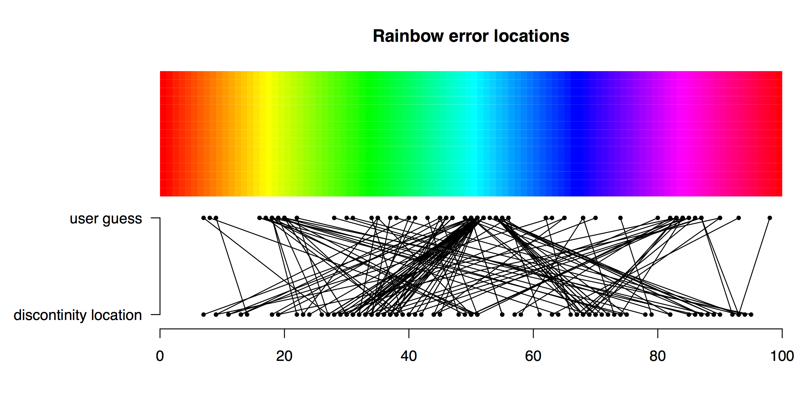
Playing “hunt the discontinuity”
TL;DR Viridis is a better palette than Rainbow for identifying a subtle feature in data. How does a plot’s colour palette affect our ability to find a subtle feature in data? Friend and colleague of Better Figures Tim Graham came up with a fun way to find out. Tim sent some Python code to plot a nice […]

