Category Maps
How many Rainbows at EGU 2018?
How are we doing in getting rid of the dreaded rainbow colour scheme in scientific visualisations? On a whim, I asked for people to count presentations or posters with Rainbow palettes at this year’s meeting of European Earth sciences mega-meeting, the EGU general assembly. Many thanks to those that stepped up. This was clearly a […]
Better figures awards?
After seeing John Kennedy’s new visualisation of warming by latitude, Richard Erskine (@essaysconcern) suggested that there should be awards for climate visualisation. We heartily agree here at Better Figures, there is so much excellent work going on that should be highlighted, celebrated and shared. We could certainly do an annual round up of the best […]

Better Figures does RMetS at the ECMWF
That’s Royal Meterological Society at the European Centre for Medium Range Weather Forecasting. We had an afternoon of Visualisation of Meterological data, part of the ECMWF visualisation week, and Better Figures was lucky enough to be invited to present (download the slides). ECMWF was great, in that they have preserved the 1970’s decor beautifully, alongside […]
A welcome development for matplotlib
Here is a great video, describing viridis, the new default colourmap for matplotlib in the programming language Python. This has some great features – It’s perceptually uniform across its range, it’s pretty, and it works for the colourblind. Oh, and you’re free to use it. The last five minutes or so describe the process and thinking […]

Picking a colour scale for scientific graphics
Here are some recommendations for making scientific graphics which help your audience understand your data as easily as possible. Your graphics should be striking, readily understandable, should avoid distorting the data (unless you really mean to), and be safe for those who are colourblind. Remember, there are no really “right” or “wrong” palettes (OK, maybe […]
Making Better Figures [Video]
Better Figures made a video! https://vimeo.com/123037693 The video offers some tips for making better figures. We cover: A brief history of statistical graphics [02:20] Everybody loves a bad figure [08:10] Some principles [11:35] Making better timeseries (applying those principles) [13:13] Projection distortion [18:00] Better Palettes [18:46] We need to talk about “Rainbow” [23:30] Design, and […]

Projection distortion
A quick fix to a map today, courtesy of Ed Hawkins over at better figures-approved blog Climate Lab Book. Ed asked “When will we reach 2°C?“, and posted this great map, showing areas of the world that have risen already by 2°C* in the last century or so. There is a nice use of appropriate […]
The pump handle
Every so often, a graphic comes along that does something so nicely, that it would seem churlish to criticise it. This is one of those times. So, we take our hats off to the people at the Earth System Research Laboratory, for creating this rather wonderful video showing the concentration of atmospheric carbon dioxide over […]
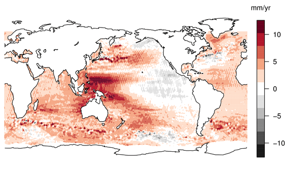
Better Palettes
Earlier this week, we were treated to some lovely unadulterated* sciency data, in the shape of a map of sea level rise in the last 18 years. The story got good coverage in the mainstream media, and an old friend of mine even got quoted on the BBC. Great. The reaction on twitter however, often […]

