People like to put together lists of rules for making better visualisations. In the published literature, I can find a couple of good examples. Rougier et al. (2014) offers some high level advice and Keheller & Wagener (2011) some slightly lower level (more practical/detailed) tips. In the blogs and on the web, there are 7 tips […]
Here is a great video, describing viridis, the new default colourmap for matplotlib in the programming language Python. This has some great features – It’s perceptually uniform across its range, it’s pretty, and it works for the colourblind. Oh, and you’re free to use it. The last five minutes or so describe the process and thinking […]

Here are some recommendations for making scientific graphics which help your audience understand your data as easily as possible. Your graphics should be striking, readily understandable, should avoid distorting the data (unless you really mean to), and be safe for those who are colourblind. Remember, there are no really “right” or “wrong” palettes (OK, maybe […]
Better Figures made a video! https://vimeo.com/123037693 The video offers some tips for making better figures. We cover: A brief history of statistical graphics [02:20] Everybody loves a bad figure [08:10] Some principles [11:35] Making better timeseries (applying those principles) [13:13] Projection distortion [18:00] Better Palettes [18:46] We need to talk about “Rainbow” [23:30] Design, and […]

Note: Better Figures is proud to support Ed Hawkins at Climate Lab Book, in calling for an end to the “Rainbow” palette. The text of an open letter to the climate science community, led by Ed, is reproduced below. An open letter to the climate science community Ed Hawkins, Doug McNeall, David Stephenson, Jonny Williams […]
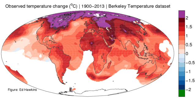
A quick fix to a map today, courtesy of Ed Hawkins over at better figures-approved blog Climate Lab Book. Ed asked “When will we reach 2°C?“, and posted this great map, showing areas of the world that have risen already by 2°C* in the last century or so. There is a nice use of appropriate […]
Better Figures was very happy to be invited to the Scott Polar Research Institute, to give a talk on data visualisation to the UK Polar network of early career scientists. The talk leant heavily on the advice from The Visual Display of Quantitative Information, by Edward Tufte. One of the original bits however, was a sequence […]
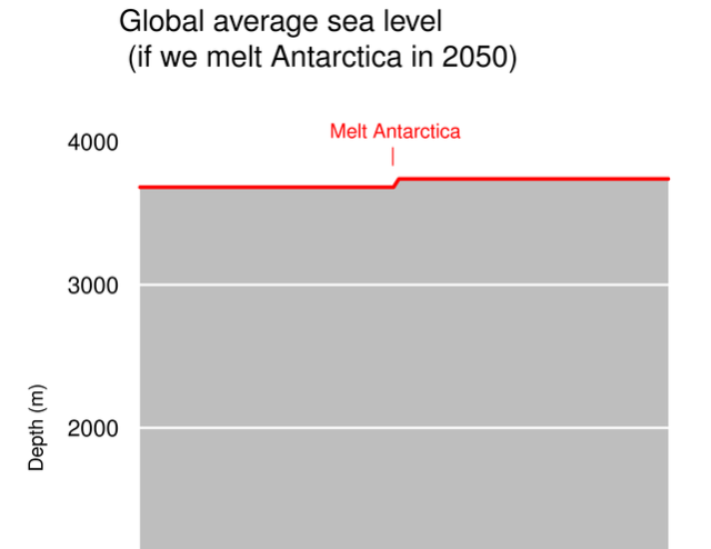
A fantastic example of how to strip meaning from a graph this week, in this little beauty from Christopher Booker in the Telegraph. “Look at the graph” he says “to see the evidence of global warming”. Just look at it. Pretty unimpressive, eh? Regular readers won’t really need me to point out just how silly […]
Every so often, a graphic comes along that does something so nicely, that it would seem churlish to criticise it. This is one of those times. So, we take our hats off to the people at the Earth System Research Laboratory, for creating this rather wonderful video showing the concentration of atmospheric carbon dioxide over […]
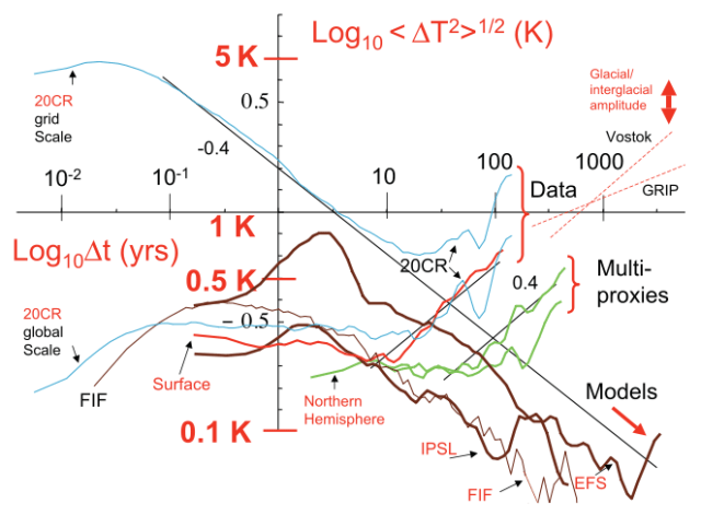
Do GCM’s (sic) predict the climate… or macroweather? Ask Lovejoy et. al, in a paper submitted to Earth System Science Dynamics Discussions, and pointed out to Better Figures by the unholy trio of Richard Betts, Ed Hawkins and John Kennedy. I don’t really want to comment too much on the science here, as that might […]

