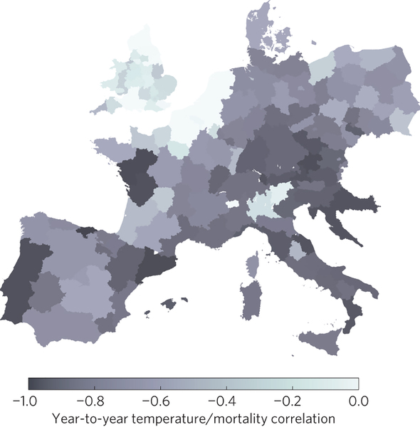
A really nice example of the use of colour in a map here. The image is from a new paper on the relationships between cold weather, influenza and mortality in Nature Climate Change (ht Ed Hawkins).
The authors have chosen a simple monochrome palette, and the map is clear from any distracting clutter. I guess the only problem is that it is a little difficult to read values directly from the map, but hey, that’s what data tables are for. The idea of a plotted data map (choropleth) is for comparison and to reveal patterns.
Paper:


So one way or another it looks like Scotland rates a big fat zero.