TL;DR Viridis is a better palette than Rainbow for identifying a subtle feature in data.
How does a plot’s colour palette affect our ability to find a subtle feature in data?
Friend and colleague of Better Figures Tim Graham came up with a fun way to find out. Tim sent some Python code to plot a nice linear sequence from 1:100, with a discontinuity of 3 somewhere in it. The challenge was to spot the location of the discontinuity when the data is plotted in either the Rainbow or the Viridis palette.
We like a challenge here at Better Figures, and coded the thing up as an interactive R Shiny app. We plotted a discontinuity of 3 at a random location between 5 and 95 (to avoid getting too close to the edge), in a linear ramp from 1:100. We served up the plot to a user randomly as Rainbow or Viridis.
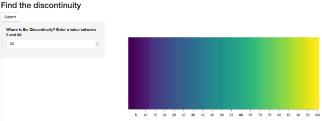
Here’s the interface.
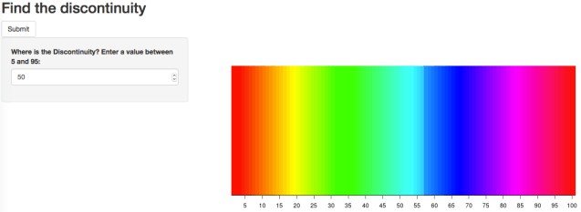
Can you spot the discontinuity? (It’s at 57 in this example). Here’s one in the Viridis palette, with the discontinuity at 12 this time.
It turns out other like a challenge too. We got more than 1200 clicks in a few days, using all our monthly free allocation of 25 hours of server time on the shiny.io server.
I (Doug) made some rookie errors in coding the user interface, which meant that some of those clicks were repeats (more on this later). After cleaning the data, I reckon we’ve got around 1000 valid “plays” of the game.
Here are the basic results, and accuracy statistics for Rainbow Vs. Viridis:
| Palette | Plays | Bullseyes | (%) | Close enough (within 2) | (%) |
|---|---|---|---|---|---|
| Rainbow | 550 | 346 | 63% | 397 | 72% |
| Viridis | 470 | 382 | 81% | 470 | 93% |
Which seems like a pretty healthy win for Viridis, with 93% of guesses within 2 of the true answer, compared to 72% for Rainbow. By this measure, the error rate for Rainbow is four times that of Viridis (28% vs 7%).
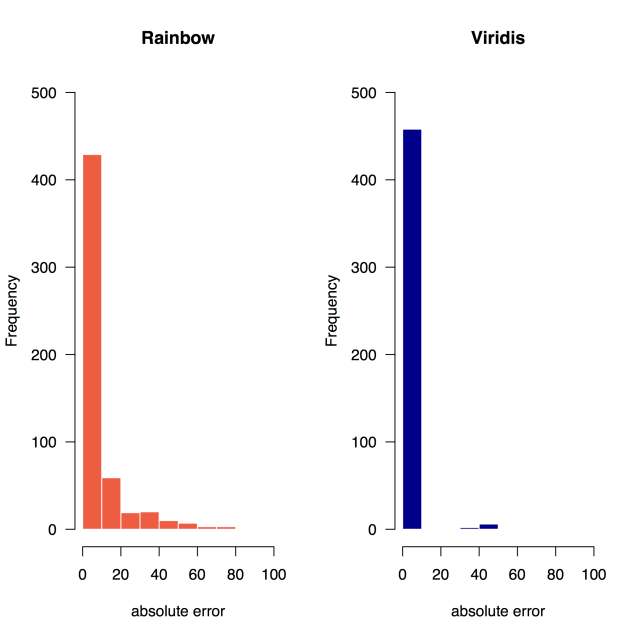
What do the errors look like? Here are the histograms of the absolute error – of course the successful guesses dominate but even so it’s possible to see that Rainbow has more errors.
We’ve got great information about the location of the errors too. If we ignore the “bullseyes” (perfect guesses), we can plot the histograms of places where users miss the discontinuity. And if they’ve missed it, we can also plot where they thought it was. Here’s the Rainbow version:
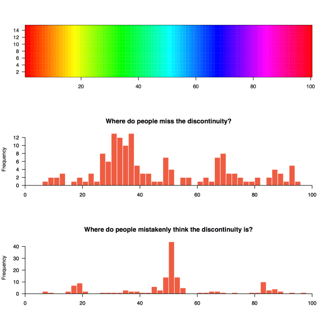
It’s pretty easy to see the pattern here – people tend to miss the discontinuity if it’s in the “green” section between about 25 and 40, where the palette doesn’t change much as the values increase. A similar thing happens in the “blue” section just below 70.
Where do people think the discontinuity is? Right where the whacking great perceptual discontinuities are in the original palette of course, just below 20, around 50, and just over 80. A big caveat here is due to some poor user interface design on my part – setting a default value of “50” for the user input box. It’s possible that a number of these inputs were the users getting confused, and pressing the “submit” button before they’d entered a value. Alternatively, they might just hit the button if they couldn’t see an obvious discrepancy. It would have been much better if I’d set the default to Zero.
Here are the results for Viridis on the same scale:
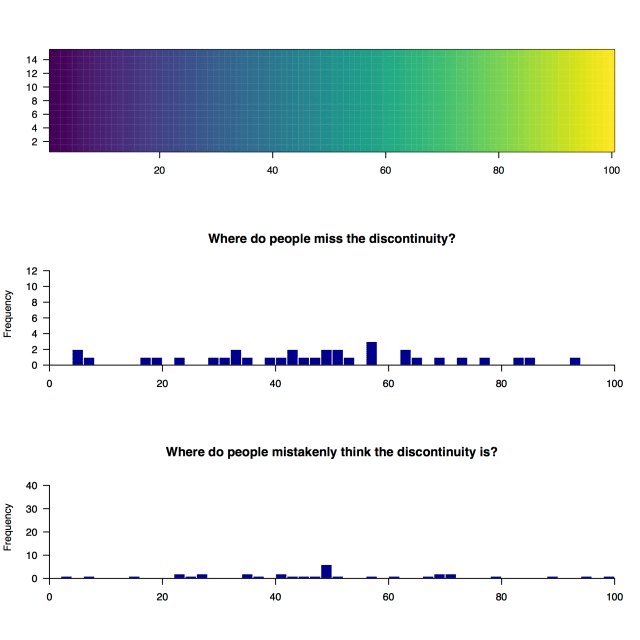
As expected with a palette that is designed to be perceptually uniform, the distribution of the location of missed discontinuities and wrong guesses is much more even. There is a small bump at the default value of 50, which is probably from the poor user interface design mentioned earlier.
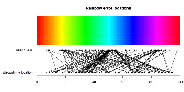
We can visualise the errors in another way too – in something I would call a cobweb plot if that name wasn’t already taken. Here, we’ve plotted a line between each wrong guess and it’s true location for the Rainbow palette:
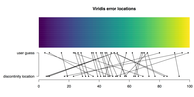
And again for Viridis:
Conclusion
The conclusion is that in these circumstances, Viridis is a much better palette than Rainbow for identifying the location of a subtle discontinuity in the data. This isn’t a great surprise!
There are things we’ve done wrong in this quick experiment, that we would certainly improve the next time round. I’m pretty sure that some of these would change our results a bit, but we’d be surprised if the overall conclusions changed:
- We’d certainly set default user input to zero, or have no default value at all.
- We’d include clearer instructions for using the app.
- The “submit” button didn’t refresh the app for another go, which meant that we got long runs of the same input, where users had just mashed the “submit” button few times. Ask us how we [probably imperfectly] cleaned this data if you’re interested.
- It would be really useful to collect collect data on whether the user is colour blind or not, more palettes, noisy data etc.
- It’s quite possible that the context has skewed the results – Doug tweeted this out with an #endrainbow hashtag, meaning that people who have an interest in killing the rainbow palette were playing the game. We also have no defence against people entering deliberately bad values (please let me know if you did this).
As Ruth Mottram pointed out, the app is quite useful as a teaching tool – it may well be limited as a research tool. But it’s a good bit of fun.
Please let us know if you can think of any other horrible ways we might have biased our experiment, and feel free to leave ideas for the next iteration in the comments.
If you’d like to know more about why colour is important in presentation, you can visit our guide to picking a colour scale for scientific graphics.


[…] than the top, and introduce perceived sharp transitions in places where none exist in the data, or hide them where they do exist. See Borland & Taylor 2007 for some great research on the problems with “rainbow” type […]