At the time of writing, the US media is tracking Hurricane Joaquin, and trying to predict whether it will make landfall in the US over the next few days.
There are lots of great visualisations, but one thing that this event does highlight is just how many different types of rainbow colour palette there are. There are different data sets, but many of these are being used to encode the same information, which can surely lead to confusion among the viewing public.
I can’t help that feel that the media pick some of these up because the bright colours catch the eye and drive clicks, rather than because they are the most informative.
The challenge is: how can we use these visualisations to best inform the public about weather risk? How can we avoid confusing people? Is that the media’s job?
I’ve found most of these by looking at the #joaquin hashtag.
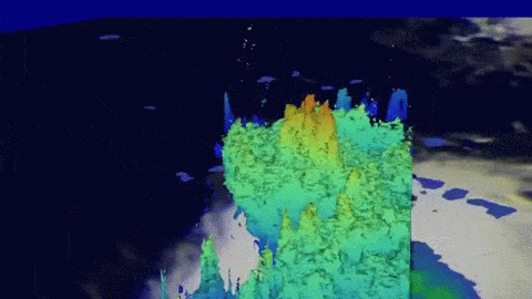
[link to video] CQPV83XUcAAU-4z.mp4
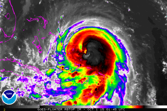
#Joaquin could be nearing a peak intensity. Category 4 likely. Incredible eye. http://t.co/OUYbIftaYH—
David Bernard (@DavidBernardTV) October 01, 2015
00z #Euro #EPS strongly suggest most likely track for #Joaquin is out to sea. Good agreement with Operational #ECMWF http://t.co/vmHlAyOzia—
Philippe Papin (@pppapin) October 01, 2015
Key messages for Hurricane #Joaquin (Thursday morning, Oct. 1) hurricanes.gov http://t.co/KrcDL7ihoV—
Natl Hurricane Ctr (@NWSNHC) October 01, 2015
Been a long time since I have seen bust like this- actual position off map! >500 mile error from 3 days ago #Joaquin http://t.co/pazbzB6BnV—
Eric Blake (@EricBlake12) October 01, 2015
29 mb pressure drop in 24 hrs; #Hurricane #Joaquin continues to rapidly intensify, could be a Cat. 4 soon. #tropics http://t.co/Tsbfh9JGDN—
The Weather Channel (@weatherchannel) October 01, 2015
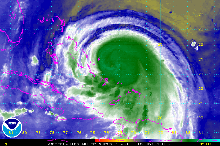
A VIIRS IR image from @NASANPP of Hurricane #Joaquin. Click to see how these images are made! go.usa.gov/3z7QJ http://t.co/qzL98xMuyp—
NOAA Satellites (@NOAASatellites) October 01, 2015
938 mb central pressure on Recon initial approach with 147mph max surface winds on the SW Eyewall! #Joaquin http://t.co/OWHuuUxxSO—
Allen Jonathan (@aallenn3883) October 01, 2015
Live Twitter flow of meteorologists' views on landfall odds for #joaquin landfall: twitter.com/search?f=tweet… http://t.co/NwdwPni9QO—
Andy Revkin (@Revkin) October 01, 2015
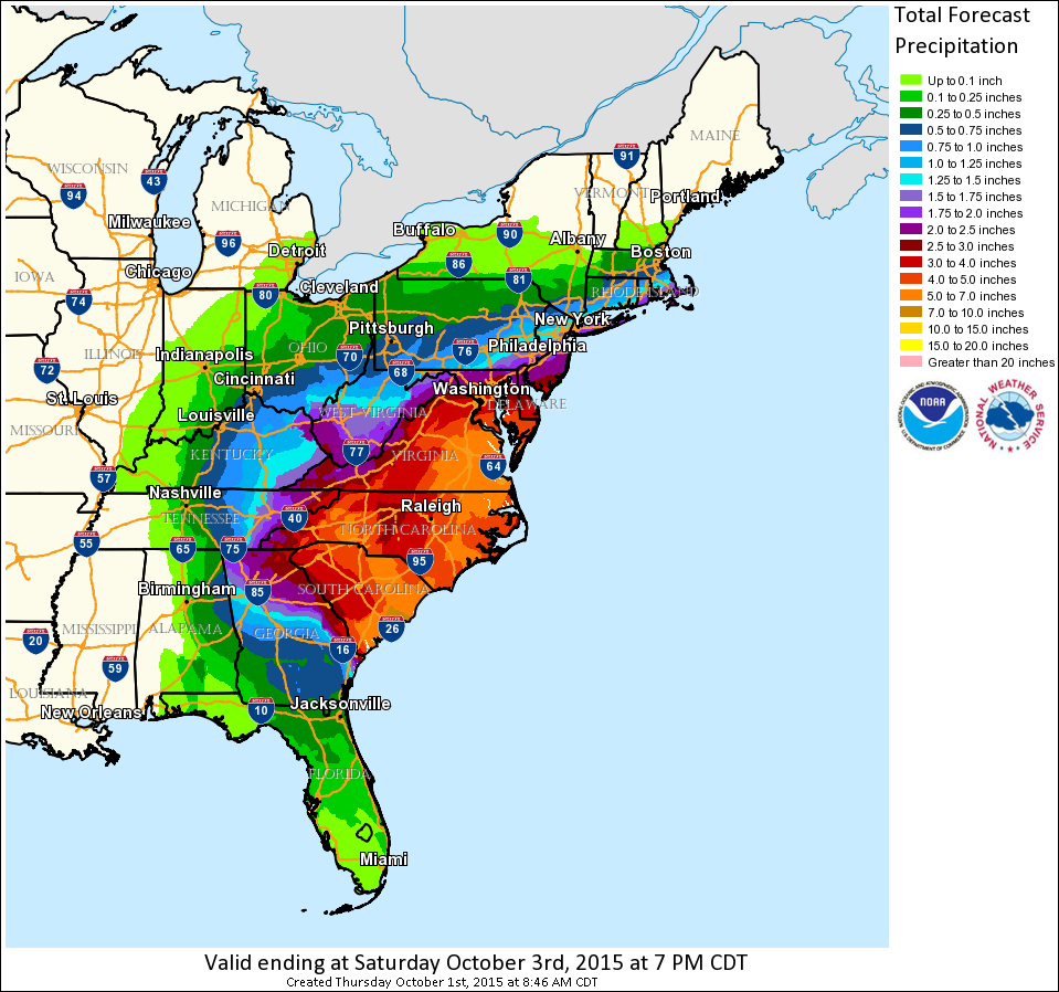
Significant #flooding expected for the East U.S., no matter if #Joaquin makes landfall or not: wxch.nl/1L6eLda http://t.co/wX2jbdrDE1—
The Weather Channel (@weatherchannel) October 01, 2015
Latest (06z) GFDL still has that nightmare Chesapeake scenario landfall for #Joaquin. Huge uncertainty. http://t.co/Gn8VlrpyrM—
Eric Holthaus (@EricHolthaus) October 01, 2015
Is #Joaquin another #Sandy? The similarities and differences. wxch.nl/1FFb2mt http://t.co/PqThY5xyzM—
The Weather Channel (@weatherchannel) October 01, 2015
With Cat 3 Hurricane #Joaquin threatening the US @AMHQ has @cambecc's wind streams on display. earth.nullschool.net http://t.co/CpyeCcvKfQ—
Kathryn Prociv (@KathrynProciv) October 01, 2015
TCOTD – Typhoon Parma – Oct. 1 blog.cyclonecenter.org/2015/10/01/tco… http://t.co/9VegUB8xEi—
Cyclone Center (@CycloneCenter) October 01, 2015
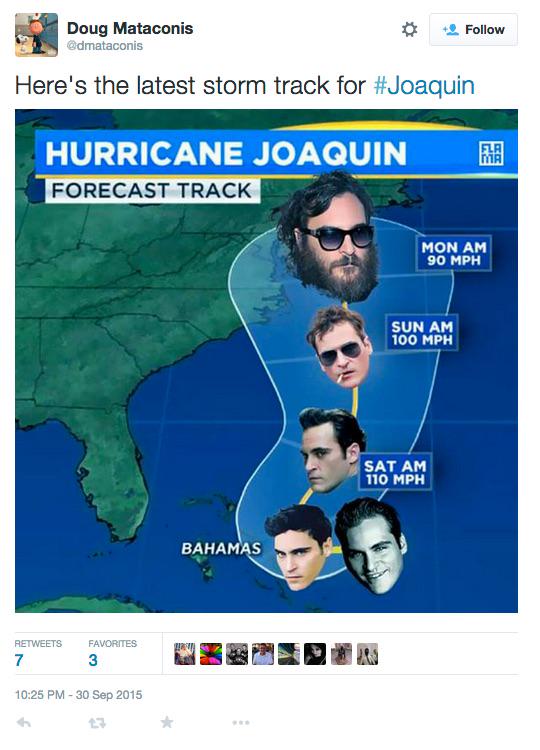
Here is my favourite though