Category palettes
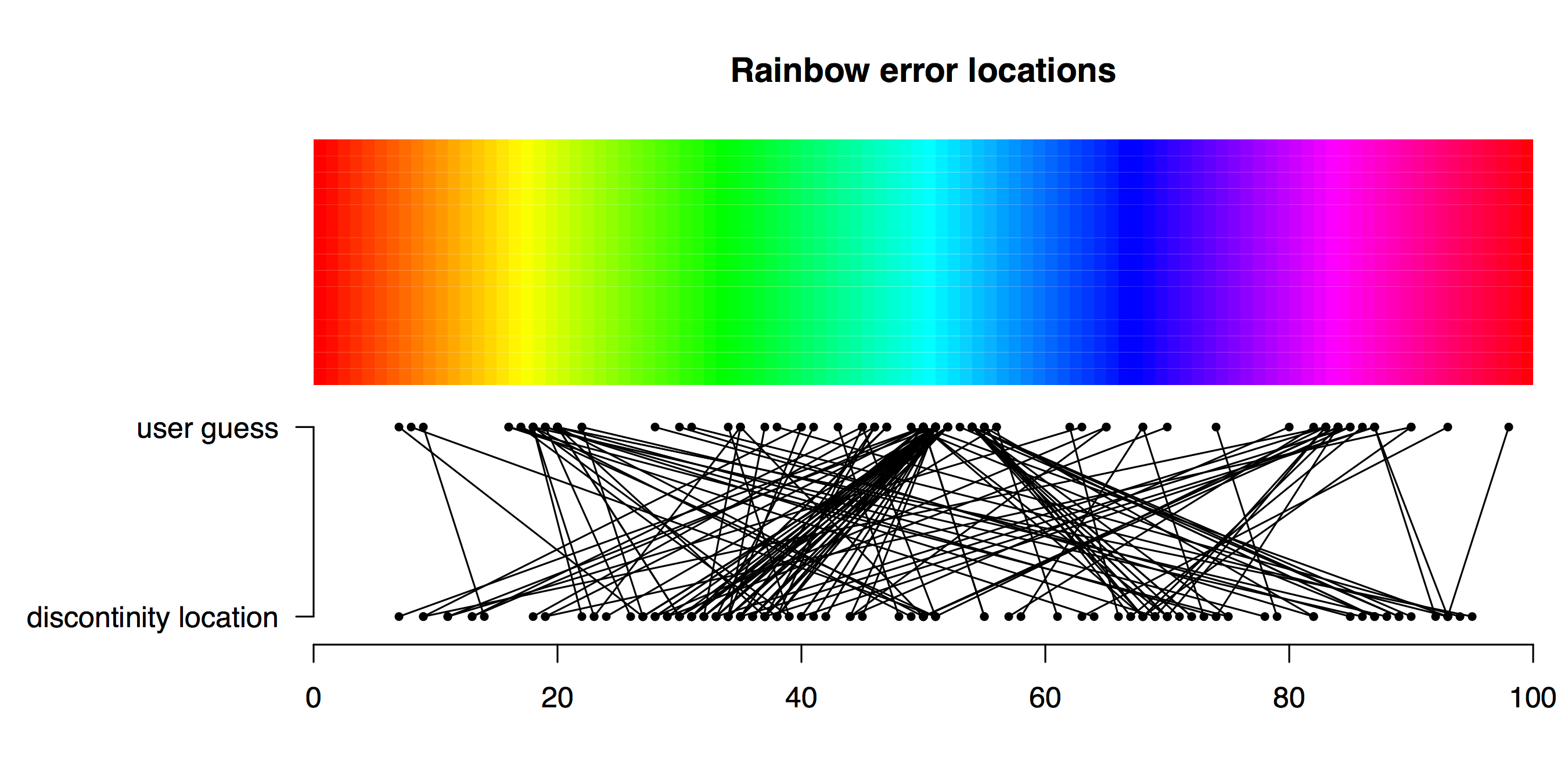
Playing “hunt the discontinuity”
TL;DR Viridis is a better palette than Rainbow for identifying a subtle feature in data. How does a plot’s colour palette affect our ability to find a subtle feature in data? Friend and colleague of Better Figures Tim Graham came up with a fun way to find out. Tim sent some Python code to plot a nice […]
How many Rainbows at EGU 2018?
How are we doing in getting rid of the dreaded rainbow colour scheme in scientific visualisations? On a whim, I asked for people to count presentations or posters with Rainbow palettes at this year’s meeting of European Earth sciences mega-meeting, the EGU general assembly. Many thanks to those that stepped up. This was clearly a […]
Better figures awards?
After seeing John Kennedy’s new visualisation of warming by latitude, Richard Erskine (@essaysconcern) suggested that there should be awards for climate visualisation. We heartily agree here at Better Figures, there is so much excellent work going on that should be highlighted, celebrated and shared. We could certainly do an annual round up of the best […]

A significant achievement
What an achievement! Yesterday, the lovely perceptually accurate open source colour palette, Viridis (we discussed it here) turned up in a major paper. The paper itself was on some gravity discovery or something, but we need to focus on what’s important here. Well done everyone.

Joaquin In Rainbows
At the time of writing, the US media is tracking Hurricane Joaquin, and trying to predict whether it will make landfall in the US over the next few days. There are lots of great visualisations, but one thing that this event does highlight is just how many different types of rainbow colour palette there are. […]
A welcome development for matplotlib
Here is a great video, describing viridis, the new default colourmap for matplotlib in the programming language Python. This has some great features – It’s perceptually uniform across its range, it’s pretty, and it works for the colourblind. Oh, and you’re free to use it. The last five minutes or so describe the process and thinking […]

Picking a colour scale for scientific graphics
Here are some recommendations for making scientific graphics which help your audience understand your data as easily as possible. Your graphics should be striking, readily understandable, should avoid distorting the data (unless you really mean to), and be safe for those who are colourblind. Remember, there are no really “right” or “wrong” palettes (OK, maybe […]
Making Better Figures [Video]
Better Figures made a video! https://vimeo.com/123037693 The video offers some tips for making better figures. We cover: A brief history of statistical graphics [02:20] Everybody loves a bad figure [08:10] Some principles [11:35] Making better timeseries (applying those principles) [13:13] Projection distortion [18:00] Better Palettes [18:46] We need to talk about “Rainbow” [23:30] Design, and […]

End of the rainbow
Note: Better Figures is proud to support Ed Hawkins at Climate Lab Book, in calling for an end to the “Rainbow” palette. The text of an open letter to the climate science community, led by Ed, is reproduced below. An open letter to the climate science community Ed Hawkins, Doug McNeall, David Stephenson, Jonny Williams […]

