Tag Archives: science
Playing “hunt the discontinuity”
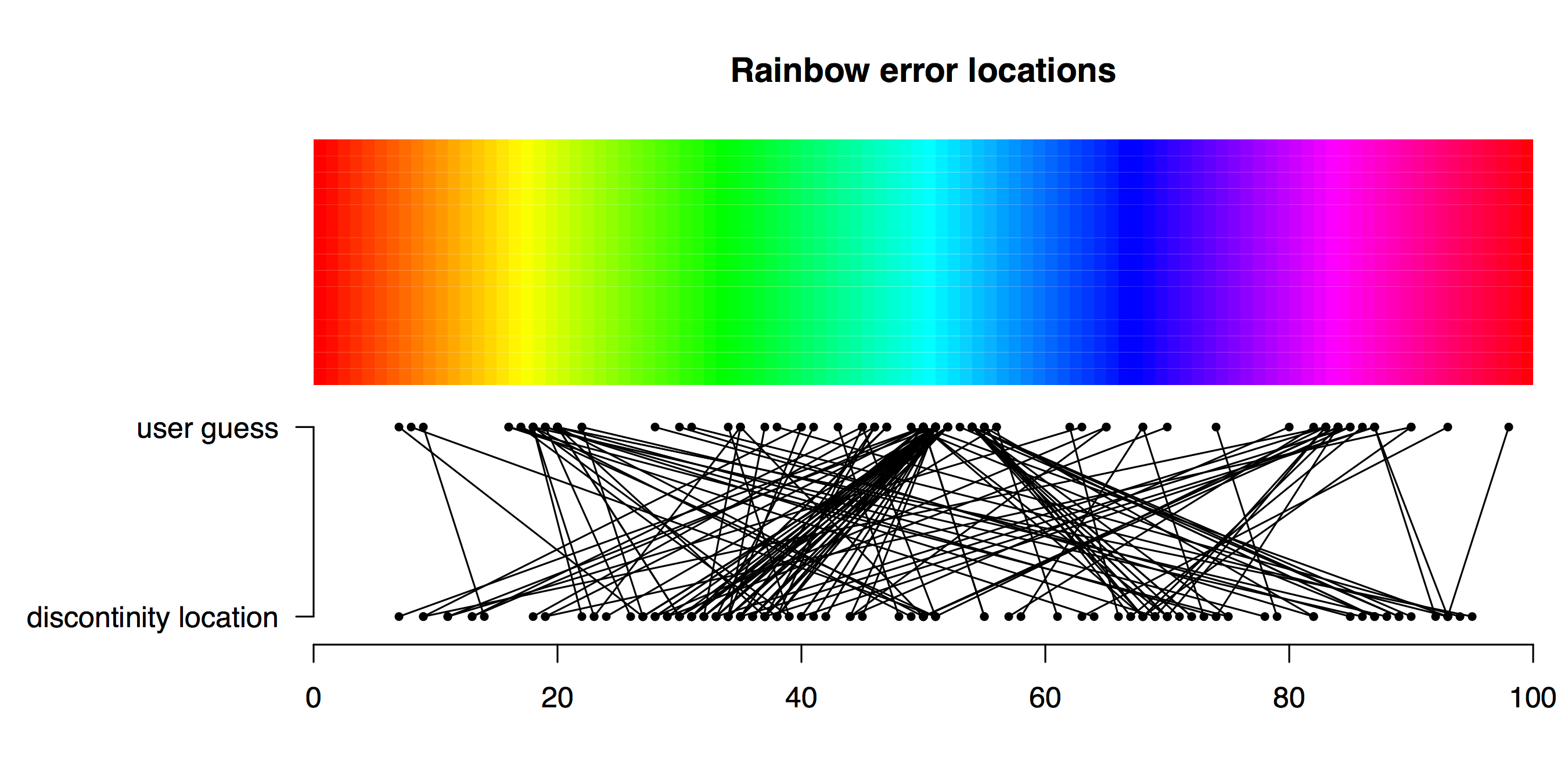
TL;DR Viridis is a better palette than Rainbow for identifying a subtle feature in data. How does a plot’s colour palette affect our ability to find a subtle feature in data? Friend and colleague of Better Figures Tim Graham came up with a fun way to find out. Tim sent some Python code to plot a nice […]
Better figures awards?
After seeing John Kennedy’s new visualisation of warming by latitude, Richard Erskine (@essaysconcern) suggested that there should be awards for climate visualisation. We heartily agree here at Better Figures, there is so much excellent work going on that should be highlighted, celebrated and shared. We could certainly do an annual round up of the best […]
Making Better Figures [Video]
Better Figures made a video! https://vimeo.com/123037693 The video offers some tips for making better figures. We cover: A brief history of statistical graphics [02:20] Everybody loves a bad figure [08:10] Some principles [11:35] Making better timeseries (applying those principles) [13:13] Projection distortion [18:00] Better Palettes [18:46] We need to talk about “Rainbow” [23:30] Design, and […]

Projection distortion
A quick fix to a map today, courtesy of Ed Hawkins over at better figures-approved blog Climate Lab Book. Ed asked “When will we reach 2°C?“, and posted this great map, showing areas of the world that have risen already by 2°C* in the last century or so. There is a nice use of appropriate […]

