Tag Archives: #endrainbow
Playing “hunt the discontinuity”
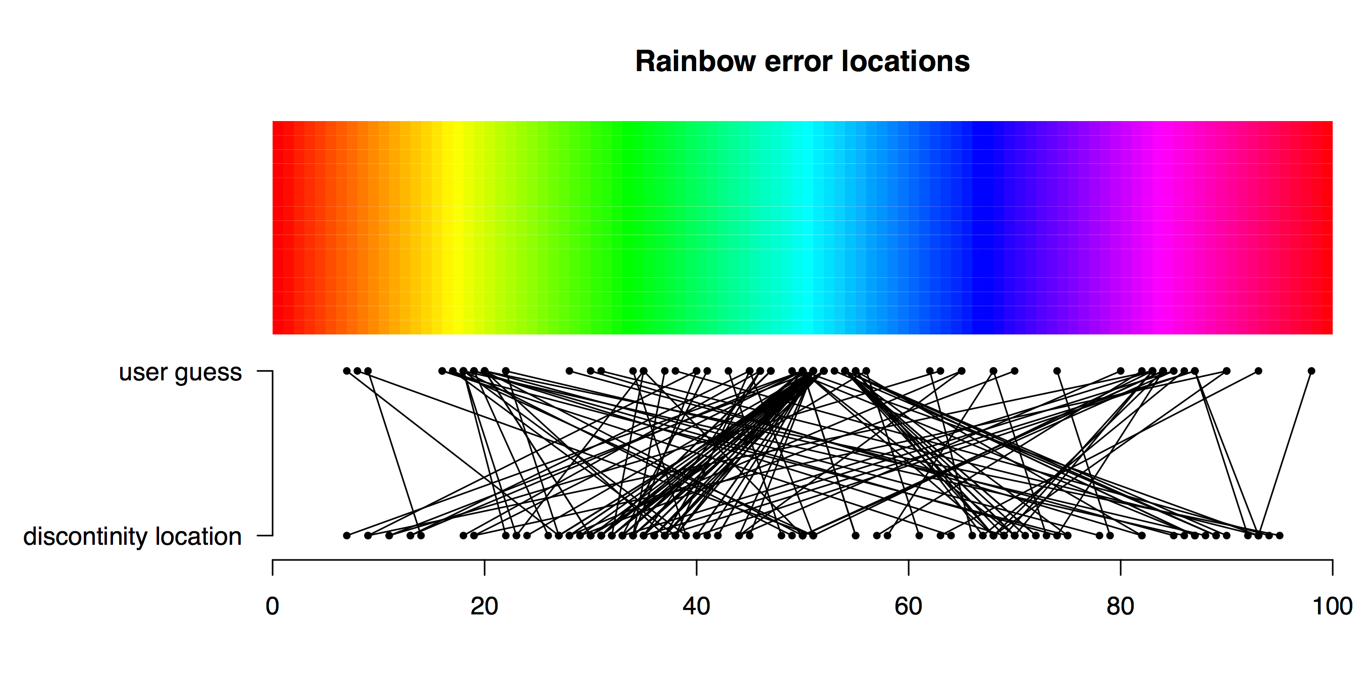
TL;DR Viridis is a better palette than Rainbow for identifying a subtle feature in data. How does a plot’s colour palette affect our ability to find a subtle feature in data? Friend and colleague of Better Figures Tim Graham came up with a fun way to find out. Tim sent some Python code to plot a nice […]
Making Better Figures [Video]
Better Figures made a video! https://vimeo.com/123037693 The video offers some tips for making better figures. We cover: A brief history of statistical graphics [02:20] Everybody loves a bad figure [08:10] Some principles [11:35] Making better timeseries (applying those principles) [13:13] Projection distortion [18:00] Better Palettes [18:46] We need to talk about “Rainbow” [23:30] Design, and […]

