Here are some recommendations for making scientific graphics which help your audience understand your data as easily as possible. Your graphics should be striking, readily understandable, should avoid distorting the data (unless you really mean to), and be safe for those who are colourblind. Remember, there are no really “right” or “wrong” palettes (OK, maybe a few wrong ones), but studying a few simple rules and examples will help you communicate only what you intend.
What kind of palettes for maps?
For maps of quantitative data that has an order, use an ordered palette. If data is sequential and is continually increasing or decreasing then use a brightness ramp (e.g. light to dark shades of grey, blue or red) or a hue ramp (e.g. cycling from light yellow to dark blue). In general, people interpret darker colours as representing “more”. These colour palettes can be downloaded from Color Brewer.

Sequential palettes from Color Brewer
Here is a great example from the NOAA climate.gov site. It shows a map of precipitation, with darker regions representing greater values.

A map of precipitation with a sequential lightness-hue ramp from climate.gov.
If the data are diverging (i.e. the data straddle zero, or show a departure from a reference value) then use two contrasting hue or brightness ramps stuck together. These often have the darker colours at each end, representing “more negative” and “more positive”.

Some diverging palettes from Color Brewer
Here is another example from NOAA. This one shows a probability map, showing where the USA is expected to be warmer or cooler than usual. In this case, we can easily check a numerical value, as the colours are few enough to check against the legend, and the map uses contours.

A map of probability of temperature anomaly from climate.gov.
A diverging palette can also sometimes be appropriate for sequential data, to highlight gradients (also see CoolWarm by Moreland). Here is a final example from NOAA, looking at the temperature of the USA. The colour scale runs across a range of temperatures that people are familiar with.

A map of temperature anomaly form climate.gov.
For maps of categorical data without an order, use a palette without an obvious order. Make sure that the colours are easy to distinguish, and colourblind friendly as far as possible. Try to avoid using too many categories, as this can make graphics confusing. Be warned! Some of these palettes are not colourblind safe.

Categorical palettes from Color Brewer
Here is an example of a categorical map, taken from the US census of 2000, with Cynthia Brewer (of ColorBrewer fame) one of the authors. It uses a small set of colours that are easy to distinguish.

A example categorical map from the US census of 2000.
Accessibility
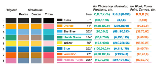
Try to ensure that your palette is accessible to those with colourblindness. Especially avoid using red and green together, as these are difficult to distinguish for those with the most common forms of colourblindness – about 8% of the male population and 0.5% of the female population. The diagram below from Ed Hawkins at Climate Lab Book, shows a simulation of a severe form of colourblindness (deuteranopia). There are a number of websites and apps that allow you to check how your visualisations will appear to those with colour blindness. If in doubt, remember that red and green should never be seen – at least not together.

A simulation of severe colourblindness.
There is a great example of a colourblind friendly categorical palette in this paper by Okabe & Ito (2002).
You can get this palette into a programming language using the RGB or CMYK values, or with the hex codes listed below. For example, you can create a colour palette in the programming language R, with the simple command:
cbPal <- c("#000000", "#E69F00", "#56B4E9", "#009E73", "#F0E442", "#0072B2", "#D55E00", "#CC79A7")
Brian Connelly also offers some excellent advice on creating colourblind friendly figures in this blog post.
Perception
Most visualisations benefit from a perceptual palette – one where the perceived values in a visualisation closely match the data. For example, steps in the data should be represented by matching perceptual steps in the hue, or lightness of the palette. Some palettes, for example “rainbow” or “spectral” palettes, do not have this property. Yellow, for example is special – it will stand out, especially against a dark background, as the human eye is particularly sensitive to that colour. Yellow is best used where you wish to highlight data. These palettes can introduce thresholds in the data where none exist, or hide thresholds that do exist. Here, for example are the perceived lightness (L*) plots for two different palettes, from MyCarta. The upper palette has many jumps, whereas the lower palette has a smoother, more linear profile.

A spectral palette, versus one with better perceptual qualities.
Sometimes, a visualisation can benefit from using a spectral palette to highlight an important part of the data, or to split the data into categories. Understanding when this is appropriate will help your viewer understand the data. Many colours have widely culturally agreed meanings: red is associated with hot, stop or danger, whereas blue is associated with cold, rain or wet. Choose culturally appropriate colours where possible.
End of the Rainbow
Don’t use a “rainbow” or similar palette if you can avoid it.

A “rainbow” or “spectral” type palette.
Rainbow palettes can be useful – they can allow viewers to check values against the legend, and highlight small differences between features. Rainbow palettes combine several of the problems mentioned above – they use both red and green, place yellow in the upper mid-range rather than the top, and introduce perceived sharp transitions in places where none exist in the data, or hide them where they do exist. See Borland & Taylor 2007 for some great research on the problems with “rainbow” type palettes. You can see many of these problems in this map using a “rainbow” type palette, taken from a paper and spotted by Eager Eyes. Although it looks as though there is a huge east/west step change in the centre of the USA, a look at the legend reveals that the transition is in fact quite smooth.

A scientific graphic using a rainbow-type palette.
A better solution is to use a palette that avoids many of the problems of Rainbow. Matplotlib recently introduced the “Viridis” palette as its new default, Matlab introduced “Parula“, and you can easily use the viridis and viridislite packages for R.

Maps made using the “viridis” package in R.
Useful resources
Colorbrewer has a useful set of palettes, including colourblind safe examples.
“The subtleties of color” by Rob Simmon is an excellent 6 part essay on use of colour in visualisation. Required reading.
This blog on #endrainbow has a great history section.
Advice on choosing colours in matplotlib.
The “background” section of this paper identifies lots of useful research for the effective and safe use of colour. Sherman-Morris, K., K. Antoneli, and C. Williams, 2014: Measuring the Effectiveness of the Graphical Communication of Hurricane Storm Surge Threat. Wea. Climate Soc. doi:10.1175/WCAS-D-13-00073.1, in press.
Dear NASA: No More Rainbow Color Scales, Please by Drew Skau.
End of the Rainbow – an open letter by Hawkins et al.
Ten simple rules for better figures (2014) by Rougier et al. in PLOS Computational biology
HCL Wizard and accompanying paper by Stauffer et al. (2015).
Color Universal Design (CUD) – How to make figures and presentations that are friendly to Colorblind people Okabe & Ito (2002)


This is a great post, very useful.
On the rainbow palette, especially in reference to the precip map of the US. This could actually be really useful if the yellowish-green to green transition was set at the generally accepted threshold for growing a particular crop without irrigation. When I saw the map, the famous “corn line” is the first thing I thought of … the cline west of which you can’t really grow corn (in traditional farming) without irrigation, or the division between Eastern forests and prairies of the plains, etc. Obviously this would be more appropriate using evapotranspiration as the variable. If the evapotranspiration limit for corn (or some other crop) was set right at that yellow/yellow-green margin then the map would have powerful meaning, in this case, intended.
Now, here’s the technical question. If you have a set of software that produces graphs (or gradients as in drawing software) how to you teach the software to use a specific appropriate palette? Shouldn’t graphic and drawing software have built in named palettes that have the appropriate characteristics? (I see some of this is in the links you provide, but it would be great to see a full treatment of this.)
Hi Greg,
Many scientific users will be able to swap palettes in and out pretty much at will, as they will be generating the code to plot their figures. Often, they can even create their own palettes. There are examples in R, python, matlab etc. For commercial software that you interact with, rather than code yourself, there should be a good set of palette options in there somewhere, if the software is worth paying for 🙂
My guess is that people’s data sets and needs might be very specific, and that it is probably worth teaching the underlying principles, rather than having a load of go-to palettes.
There’s a palette that is often used in climate science that mixes the useful distinct categories of a rainbow palette with the clarity of a diverging palette: Have darkish blue on the left, shading to pale green just below zero; switch to pale yellow just above zero, then shade to darkish red. The distribution of both hues and luminances is much more balanced than on an HSV rainbow (and the greens and reds are distinguished by having luminance). I haven’t seen an automatic way of generating it yet, and it’s not quite any of the ColorBrewer palettes….
Not exactly what you are describing, but cmocean has three nice diverging palettes: https://matplotlib.org/cmocean/
Question: I know of many R packages for manipulating colours in different spaces (scales, munsell, colorspace, RColorBrewer), but I don’t know about this sort of thing for python.
Some of the functionality is probably in matplotlib already, but it’s probably somewhat overcomplicated at best. Are there other python packages better suited for colour manipulation?
I’ve heard good things about seaborn.
See Borland & Taylor 2007 for some great research on the problems with “rainbow” type palettes. 😀
[…] If you’d like to know more about why colour is important in presentation, you can visit our guide to picking a colour scale for scientific graphics. […]