Tag Archives: Maps
Better figures awards?
After seeing John Kennedy’s new visualisation of warming by latitude, Richard Erskine (@essaysconcern) suggested that there should be awards for climate visualisation. We heartily agree here at Better Figures, there is so much excellent work going on that should be highlighted, celebrated and shared. We could certainly do an annual round up of the best […]
Making Better Figures [Video]
Better Figures made a video! https://vimeo.com/123037693 The video offers some tips for making better figures. We cover: A brief history of statistical graphics [02:20] Everybody loves a bad figure [08:10] Some principles [11:35] Making better timeseries (applying those principles) [13:13] Projection distortion [18:00] Better Palettes [18:46] We need to talk about “Rainbow” [23:30] Design, and […]

End of the rainbow
Note: Better Figures is proud to support Ed Hawkins at Climate Lab Book, in calling for an end to the “Rainbow” palette. The text of an open letter to the climate science community, led by Ed, is reproduced below. An open letter to the climate science community Ed Hawkins, Doug McNeall, David Stephenson, Jonny Williams […]

Projection distortion
A quick fix to a map today, courtesy of Ed Hawkins over at better figures-approved blog Climate Lab Book. Ed asked “When will we reach 2°C?“, and posted this great map, showing areas of the world that have risen already by 2°C* in the last century or so. There is a nice use of appropriate […]
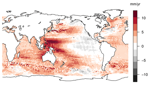
Better Palettes
Earlier this week, we were treated to some lovely unadulterated* sciency data, in the shape of a map of sea level rise in the last 18 years. The story got good coverage in the mainstream media, and an old friend of mine even got quoted on the BBC. Great. The reaction on twitter however, often […]

