Category Chart

How to strip meaning from graphs
A fantastic example of how to strip meaning from a graph this week, in this little beauty from Christopher Booker in the Telegraph. “Look at the graph” he says “to see the evidence of global warming”. Just look at it. Pretty unimpressive, eh? Regular readers won’t really need me to point out just how silly […]
The pump handle
Every so often, a graphic comes along that does something so nicely, that it would seem churlish to criticise it. This is one of those times. So, we take our hats off to the people at the Earth System Research Laboratory, for creating this rather wonderful video showing the concentration of atmospheric carbon dioxide over […]
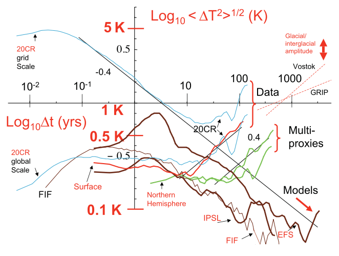
Too much information?
Do GCM’s (sic) predict the climate… or macroweather? Ask Lovejoy et. al, in a paper submitted to Earth System Science Dynamics Discussions, and pointed out to Better Figures by the unholy trio of Richard Betts, Ed Hawkins and John Kennedy. I don’t really want to comment too much on the science here, as that might […]

Decadal Temperatures
My colleague John Kennedy has asked for some feedback on this figure, showing the evolution of global average temperatures, since the 1850s. The data is from HadCRUT3, and is averaged into decades. I like this figure a lot. I think it is clear and crisp; the colours have appropriate cultural meanings; the rise in global temperatures is captured […]

