Better Figures was very happy to be invited to the Scott Polar Research Institute, to give a talk on data visualisation to the UK Polar network of early career scientists.
The talk leant heavily on the advice from The Visual Display of Quantitative Information, by Edward Tufte.
One of the original bits however, was a sequence of diagrams suggesting ways to make a timeseries easier to understand. The principles we use are set out briefly in the talk:
- Remove non-data ink (or pixels), where possible.
- Don’t make the reader work too hard.
- Design is choice: what is it you are trying to say?
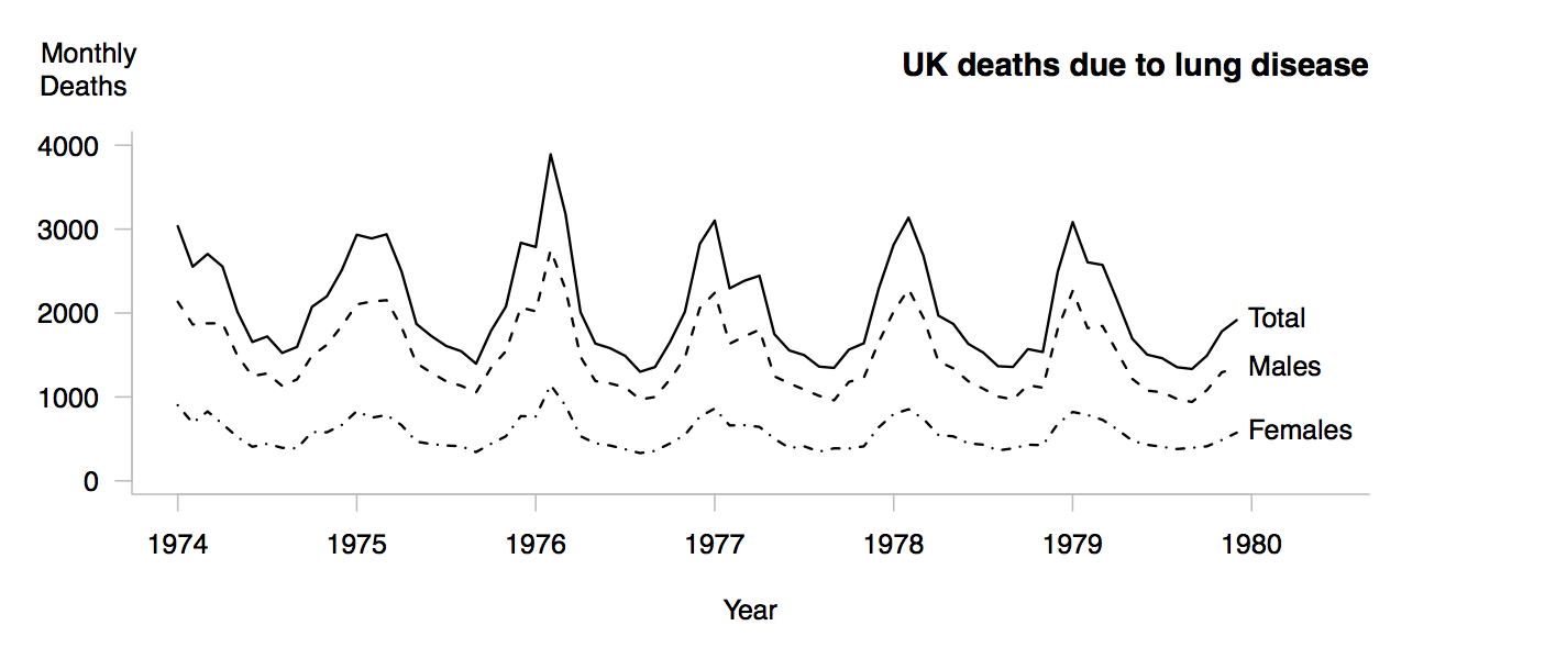
The dataset is “ldeaths” – monthly deaths due to lung disease in the UK in the late 1970s. The dataset is one that ships with R, and is available by just typing “ldeaths” into the console. To see other avalilable datasets, just type data() into the command line.
We start with the default output from R:

Monthly deaths due to lung disease in the UK. The dotted line shows number of female deaths, the dashed line shows male deaths, with the total shown by the solid line.
We’ve added a caption to help identify the lines. the dataset “ldeaths” only gives the total, so we’ve added “mdeaths” (males) and “fdeaths” (females) to the plot. There is clearly a strong seasonal signal, but can we make the plot any clearer?
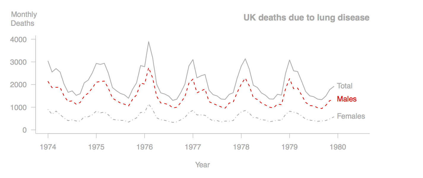
First, we’ll fix the aspect ratio. Tufte suggests that the average slope of a timeseries should be around 45 degrees, but there are clearly choices to be made here. For example, many timeseries can be fit on a page for comparison, if the aspect ratio is higher.

We’ve also added a legend in the top right, although it is tricky to quickly identify which label belongs to which line. It might be clearer to label the lines directly:
We’ve also rotated the y-axis labels, removed the distracting box, and tried to reduce the impact of the (unimportant) axis lines.
Other Design Choices
The same trick with the palettes can be used if you want to highlight some aspect of the data – perhaps using a restricted palette of colours in order to draw attention to something:
Finally, we notice that the timeseries can be simplified. As the “Total” is just the sum of the “Males” and “Females”, we can get rid of one of the lines altogether. The plot might be better as a stacked timeseries:
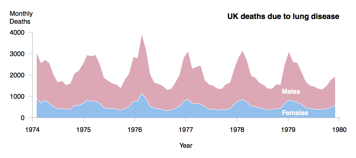
This visualisation obviously owes a great deal to the marvellous baby name wizard. And yes, we have chosen those colours on purpose, as pink is a nice strong shade for boys. It also serves as a reminder that the palette you choose will have cultural baggage, so best to take that in into account from the start.
How would you change the figures? Suggestions for improving the plots are, as always, very welcome.
UPDATE 20/09/2013
After comments from Lucia, this post was edited sightly (added subheading “Other design choices”) to make it clear that the last two plots are not necessarily an improvement, but might highlight different aspects of the data.


To improve the graph: Avoid stacking. Stacking makes it difficult for people to quantify. More here.
http://rankexploits.com/musings/2013/what-i-hate-about-this-figure/
(BetterFigures edit Hmm, having problems with the link. Apologies.)
Make the y axis start from zero?
They all start from (contain) zero, but the default R setting is to add a little bit to the range. I’ve overridden that on the last plot.
That’s a lousy default! Glad I don’t use R.
Graph 3 is probably the best. Stacking two graphs is only useful when what you care about is the total and one of the two categories (which you show at the bottom). In this case male and female are equally “important” so the stack makes no sense.
FWIW I agree with Lucia that stacked graphs are generally crap, for the reasons she expresses.
Doug, I love it, well done. It is without a shadow of a doubt a BETTER timeseries.
Something that’s quite commonly a problem with timeseries graphs, as with all of these, is the ambiguity of the x axis. Does the tick mark for 1976 correspond to the beginning of the year (1976.0) or does it mark the mid-point? In this case, where there are quite a few data points for the year I’d assume it’s the beginning but I’d not be completely confident. When there’s only one or a few points (e.g., for the DJF, MAM, JJA and SON seasons) per year it can be even less obvious.
Putting the tick marks at the period (year) boundaries but the labels between them would be a lot clearer.