A fantastic example of how to strip meaning from a graph this week, in this little beauty from Christopher Booker in the Telegraph.
“Look at the graph” he says “to see the evidence of global warming”. Just look at it.
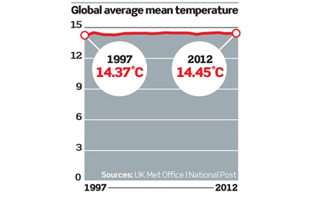
Pretty unimpressive, eh?
Regular readers won’t really need me to point out just how silly plotting a short term temperature record against an arbitrary temperature value is (even while claiming it isn’t arbitrary!). We at better figures wonder how Mr Booker missed the opportunity to plot it against absolute zero?
In the spirit of the graph, let’s do a thought experiment. What if we had some amazing machine, that were able to instantaneously melt Antarctica? That would have a pretty dramatic effect on sea level, wouldn’t it? Certainly at least an order of magnitude larger than the projections that the IPCC has made in the past, or what the current scientific thinking might suggest.
Let’s make a plot. Thanks to this (rather nicely illustrated) story on the beeb last week, we know that the biggest ice cube on the planet is worth around 58 metres of sea level rise. Wikipedia links to a paper that has the mean depth of the ocean at 3,682 metres. So, what would happen to the sea level, if we took that colossal amount of freshwater, and put it in the ocean in 2050?
This.

So, nothing to worry about, right. Except for, er, swamping a significant proportion of the planet’s coastal cities*.
OK, so we’ve probably missed some pretty important details, but still, I hope this illustrates the point. We should be placing changes in temperature in historical context, and showing what they mean for the people and systems that experience them. We shouldn’t be stripping the meaning out of the numbers.
Here is some good advice from Edward Tufte:
“The urge to contextualize the data is a good one, but context does not come from empty vertical space reaching down to zero, a number which does not even occur in a good many data sets. Instead, for context, show more data horizontally!”
* We’d like to point out that a 58 metre rise in sea level is not going to happen on a timescale that humans are capable of thinking about.


watts up had a chuckle at contrast of duelling stick graph (nc the Telegarph one)
“I have to chuckle at the battle going on with stick graphs this weekend. Choose your weapon, flat or vertical blade, real data, or proxy data with an arbitrary extension added by the special effects department.”
thoughts on the Romm graph?
Hi Barry,
Thanks for pointing this out, I might get to other graphs in the future. In the meantime, what do you think of the points I make here? I’d rather keep it on topic, thanks.
Doug
Monitoring human body temperature was I thought another good example mentioned by someone on the Edward Tufte forum linked above.
If you wanted to strip meaning from the graph, you might
* Introduce your own entirely arbitrary zero point
* Plot the graph relative to that line
* Colour everything above that line red, and everything below the line blue
* Label it “anomaly”
OK Paul how about:
* Finding a meaningful reference point that doesn’t ignore important context, or introduce spurious comparisons.
* Plotting all of the relevant data, showing historical variability, so that people can judge compared to their experiences.
* Including estimates of uncertainty in the data.
I don’t think you can do all that in one graph. Different graphs serve different purposes.
What if you took the raw data from every met station that had a record of (say) greater than 100 years, without station moves, and made one huge spaghetti graph. I’m sure that no one could question the data, as I’m sure no one could see anything discernible in the graph. – I’m sure that you could also lop off end sections that you didn’t like in order to present a nice tidy story.
The graph appears again here-
http://www.realclearpolitics.com/articles/2013/04/04/the_end_of_an_illusion_117795.html
That’s great – the author actually admits that zooming out on the data is a manipulation, although worryingly he seems to think that this is a valid thing to do.
There seems to be little merit in any of the rest of the piece.
HI Doug, what did you think of the graphs in MBH 1998, Mann et al 2006, Gergis et al 2012 and Marcott et al 2013?
I don’t know the origins of the graph above, but it’s meaning to me is that we’ve had no significant temperature increase in 15 years while the CO2 has gone up by 30ppm, while we had a 0.4C rise in temperature between 1980 and 1995 with an almost identical rise in CO2. Now in any other science, or engineering activity that would send the practioners scurrying for their, metaphorical, slide rules to see what they’d done wrong and check their hypothesis. Not so in climate science just the assertion that people who point this out are dumb smart asses.
It looks to me as though you’re ignoring data that doesn’t fit the hypothesis, and at the same time pointing out that the years 1995 -2012 are the hottest on record to keep the scare going. I could be wrong, I usually am, but can you point me to any scientific activity where similar practices are carried out.
I”d still like your opinion on the graphs in the papers I mentioned.
Thanks
gerry
Hi Doug, looks like my comment didn’t get through moderation, I find it disappointing, because it wasn’t off topic and was polite, but not surprising given the deafening silence we’ve had from the climate science community about these hockeystick graphs.
If you tell people you’re 90-100% certain that human emissions caused the increase in temperature at the end of the 20th century in 2007, AR4, then you can expect them to pick up on the fact that in 2007 there had already been a hiatus in temperature increases of 10 years which has continued to this day. As ever with alarmists you’ve made your own argument inferring that the importance of this graph is that it doesn’t show the warming that took place at the end of the 20th century and emphasise that the last ten years have been the hottest on record. What is shows is that the emphatic attribution that humans had caused the late 20th century rise in temperature was political and not scientific.
I would really appreciate it if you could let me have, or point me to, the definition of “scientifically significant” that carries weight over the statistical analysis of a time series.
gerry
Thanks, you’ve got my email if you want to communicate privately
Hi geronimo,
A few notes, I hope you don’t mind.
1) My time to blog is very limited – the vast majority is evenings, weekends, lunchtimes. Sometimes I don’t get to comments quickly, please don’t read too much into it. I think some of your extrapolation of my and my colleagues motives and actions to be pretty heroic, to be honest.
2) Please don’t question the motives of graph makers (I resent being called an ‘alarmist’, see comments policy).
3) Please stay on topic – people will find it difficult to see the flow of a discussion if it relies on knowledege of discussions going on at other places (I’ll be amending my comments policy appropriately).
4) You’ve brought up some interesting ideas about discussing other topics. That is fair enough, but I don’t think a comment stream is the place. I’ll add a new page to the blog for suggestions.
Cheers,
Doug
HI Doug, apologies, I’m used to full time bloggers.
“I think some of your extrapolation of my and my colleagues motives and actions to be pretty heroic, to be honest.”
Sorry Doug I’m not sure what motives I’ve assigned to you and your colleagues. I’m pointing out that the graph you put up wasn’t a graph that purported to show that global warming had stopped, but a graph that showed it hadn’t gone up at all while the CO2 had risen, which doesn’t seem of any interest to the climate science community. You can put your own motives in there, but that’s an observation, which indeed could be wrong, there may be thousands of atmospheric physicists beavering away trying to understand what’s going on.
If you mean the bit about stopping talking about rising temperatures when the temperature rises stop and changing the story to “the hottest years on record”, it’s difficult to understand what motive there could be for the Chief Scientific Officer of the Met Office not mentioning that temperatures haven’t risen in 15 years other than to keep the public in the dark about the hiatus. I’ve drawn a conclusion as to why the public are being kept in the dark by the Met Office. It may be wrong, but like the rise in CO2 at the end of the 20th century I can’t think of anything else other than she doesn’t want the public to get the idea we aren’t in danger.
I apologise unreservedly for calling you alarmist, and will refrain from doing so in the future should we engage on any topic.
I agree wholeheartedly that we should stay on topic, but (a reservation this time), you raised the issue of dodgy graphs, and you’re right to do so, but, it is my view, that one can’t pick and choose dodgy graphs, if one does then that leaves an opening for smart-asses to produce their own selection of dodgy graphs for your comments.
Thanks,
gerry
Hi Doug
Actually, as one of those who Tufte describes as a “consumer”, I like both graphs and find them both quite contextual as to the points they make.
The global average temp graph clearly shows the tiny fraction of a degree that temperature has increased, relative to a quite reasonable – in the context of global temperature – benchmark of 15 degrees. The 15 year time period is also a reasonable rounded off number, in this context.
Your Antarctic ice melt graph is also very clear. I have no trouble seeing that the blip represents a fair few metres, even if only a small fraction relative to of thousands shown. I wouldn’t expect many would see it only as a trifling couple of inches, as you seem to imply.
Taking the idea of context a bit further, Paul makes a perfectly reasonable comparison to the many, many graphs we get shown with “the anomaly” represented in what might be described as somewhat out of context manner.
BTW congrats on your site – and also the nicely considered design.
Too funny. I think you didn’t like my reaction to your next post. But the reason generally abhor stacked graphs is that they strip or obscure meaning.
As for PaulM’s point about anomalies: He makes a good one. But a more nuanced one would be to recognize that quite often the no graphical method is entirely good or bad. One makes tradeoffs. The anomaly method and graphs based on it do:
1) Obscure the fact that model mean absolute temperature differ from each other by quite a substantial margin.
2) Obscure the fact that mean absolute temperature of most models must differ from the earths as no matter what one estimates for the mean temperature of the earth being 14K or 16K, it will differ from many of the models.
3) Trick many of the uninformed (some of whom think they are informed) into believing that models and observations actually agree during the baseline periods.
For evidence of 3 all you need do is see people’s interpretation of Real Climates defense of models which provide a graph that includes the 20 years from the AR4 baseline a few years after and the coos that the observations are well inside the model spread because they aren’t outside in that graph. You’ll find people who will consider the broad agreement in during the baseline as meaningful, and so — in that context– think the slowly growing divergence to just be something one would “expect”. But this isn’t so, and one could do montecarlo on systems with red noise and different trends to show that sort of ‘test’ is pointless especially if the observations being tested are too close to the baseline period.
Of course this does not mean that graphs of temperature anomalies are inherently bad. They illustrate a particular method of viewing data that might be useful in some contexts. But the choice does strip certain types of meaning– and in the case of climate, they do strip certain meaning. Also: the graph’s appearance and what it communicates can change based on arbitrary choice of baseline. For example: What happens to model agreement if you pick 1900-1930 as a baseline? What happens to the spread in forecasts? (BTW: I’m glad to see the AR5 has at least shifted the baseline for graphics back in time relative to the choice in the AR4. This reduces the problem I describe in 3.)
It’s true that the person who makes that graph might think the meaning stripped is unimportant meaning while that retained is important meaning. But it is best to openly admit that one has stripped that meaning from ones own graph and explain why they think that meaning lost is unimportant in the context where the graph is used. Or failing that, at least recognize that other people are going to recognize that your (or the IPCC’s) choice of graphics has stripped certain information, they may rightly note that information would have conveyed a meaning theythink is meaningful. And when you criticize other people’s graphics as you do here with the Booker in the Telegraph, they may point out that, pretty as they are, your graphs and those in the IPCC also strip meaning and that the strippage can be important to interpreting some important claims in climate science.